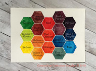
Color Theory Chart
Posted by DecoArt on Oct 10th 2018
Hello everyone, Catherine here! Today I want to share a fun project - that’s also a little bit educational too, and the end result is something you can not only be proud of -- but frame and hang on your wall as a reminder of basic color theory! I don’t know about you, but in the past I found myself at times struggling with color -- from mixing colors to which colors look good together. For the purpose of this project, I used my iPad to work out the color placement of my squares to make sure the color placement would look nice and to determine what number of hexagons would fit on my chart.
Items Needed:
- 11x15 Strathmore Bristol Paper
- 3" Hexagon (printed On Heavyweight Paper And Cut Out)
- Ruler
- Paintbrushes
- Palette
- Pencil
- Water
Instructions:

Before we get to making the color chart, let’s start with the basics. There are 3 primary colors -- these are colors that you can’t mix. The 3 Primary Colors are: red, yellow and blue. It’s important to note that I used DecoArt Media Fluid Acrylics in Primary Cyan, Primary Yellow and Cadmium Red Hue for this color chart.
The next set of 3 colors, also called secondary colors, are the colors you get when you mix the primary colors together. I used, in my experiments; equal parts of these colors.
Yellow Red = Orange
Red Blue = Purple
Yellow Blue = Green
The next set of colors, are referred to as tertiary colors. There are 6 tertiary colors and are the colors you get when you mix a primary color and a secondary color together.
Yellow Orange = Yellow-Orange
Yellow Green = Yellow-Green
Red Orange = Red-Orange
Red Purple = Red-Purple
Blue Purple = Blue-Purple
Blue Green = Blue-Green (not included on my chart)
For the purpose of this project, I also mixed two sets of compliments together, and some secondary and tertiary colors together.
Red Green = Brown
Blue Orange = Greenish Blue
You can duplicate what I did:
1. Find the center of the Bristol Paper, vertical and horizontal.
2. Using a pencil, position the hexagon in the very center of the paper, where the horizontal and vertical center lines intersect and trace the shape lightly with a pencil. Continue tracing the hexagon until you have at least 17 shapes.
*Tip: Use a larger paper or smaller hexagon for more space to experiment with color mixing.
3. On the palette, pour out equal amounts of the 3 primary colors: red, yellow and blue. Use the other clean wells on the palette to mix the secondary colors.

4. Starting on the top left corner, fill in the first hexagon with green, the middle top hex with red and the right top hex with purple. Now fill in the bottom left with yellow, middle with orange and bottom right with blue. These are your 3 primary and secondary colors.

*Tip: Clean your brush often and do not contaminate your colors. Replace the water in your water bucket often, too! This will keep your colors pristine and reliable.
5. Now, mix the tertiary colors, as noted in the list above and fill in the middle row of the chart: Yellow-Green, Red-Orange, Blue-Purple
6. Mix the yellow and orange together and fill in the hex between them. Mix the orange and blue together and fill in the hex between them.

7. Now mix the green and red together and fill in the hex between them and then mix red and purple together, getting another tertiary color -- Red-Purple, and fill in the last outer hexagon.

8. Now we are left with 4 hexagons in the very center of the color chart. I chose to mix colors that were near each other, in some cases primary and tertiary together (Yellow Yellow/Orange) and others where I had mixed a primary and 2 compliments (Blue Orange/Blue) (Red Green/Red) and (Purple Red/Purple).
9. If you chose to make a chart with more than 17 colors, you can begin mixing white (to achieve tints) or black (to achieve shades) with the colors that are already in your chart and fill in more area. Or, just keep experimenting and see what you come up with.

Here are some other color charts I’ve made over the last year and a half, the majority of them using DecoArt Media Fluid Acrylics. While I do think I have a better understanding of color, I certainly know that I have a LONG way to go to achieve a complete understanding of color and color harmony.


